SUPER GOOD
SINCE 1950
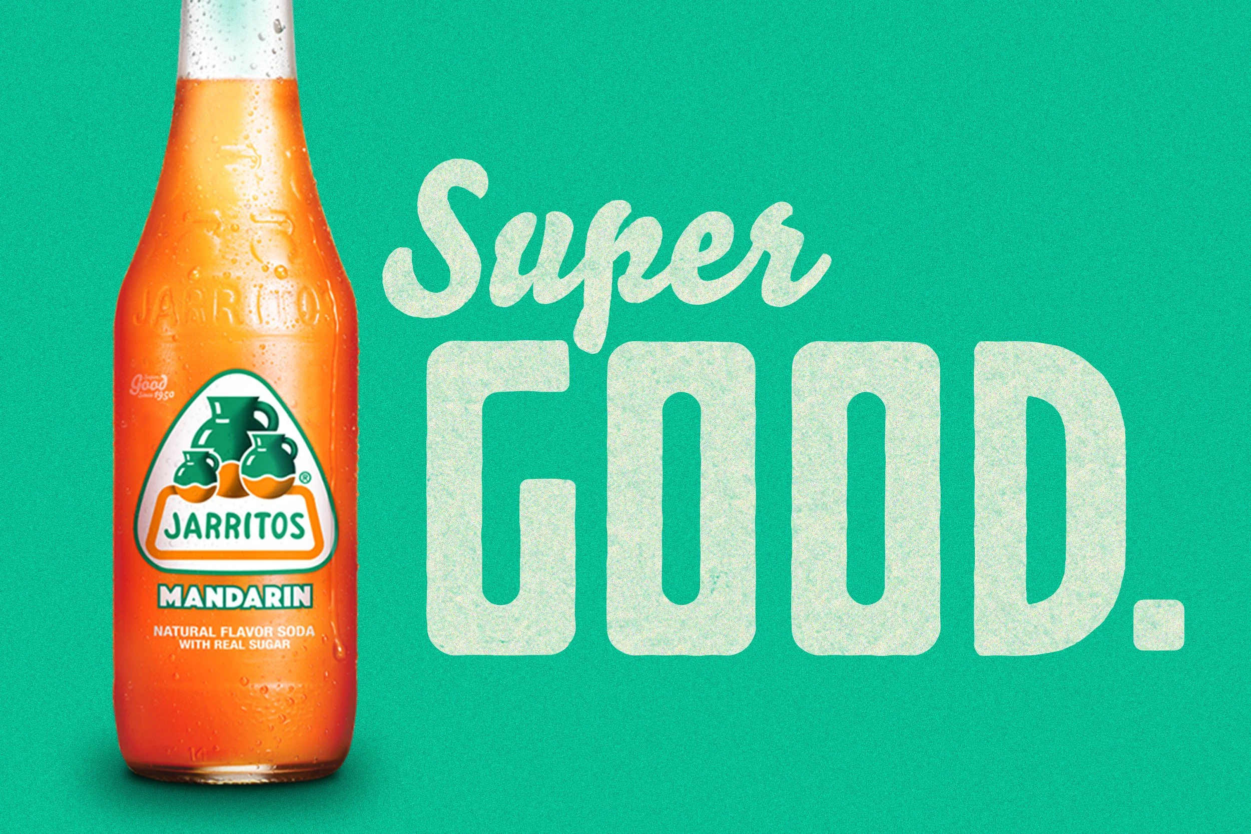
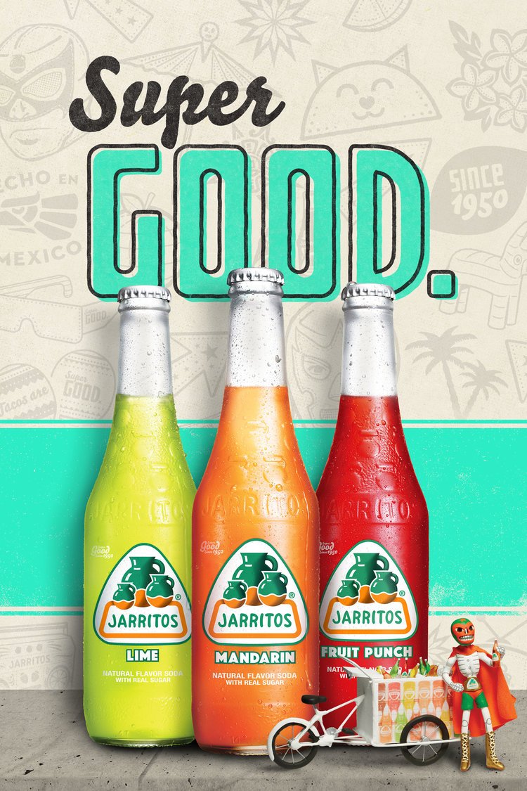
Refreshing a beloved brand is no small feat. The challenge was to refocus the brand and reenergize it without alienating the core audience that has grown up with it and considers Jarritos a close family friend. The iconic glass bottle became the focus of the refresh. Simplifying and unifying the bottle allowed us to then unite the brand's look and feel through a contemporary mid-century aesthetic that honored its heritage, enticed new tasters to try it, and did not fracture or turn off its core audience.
ROLES + RESPONSIBILITIES
Copy Writing / Art Direction and Design / Illustration
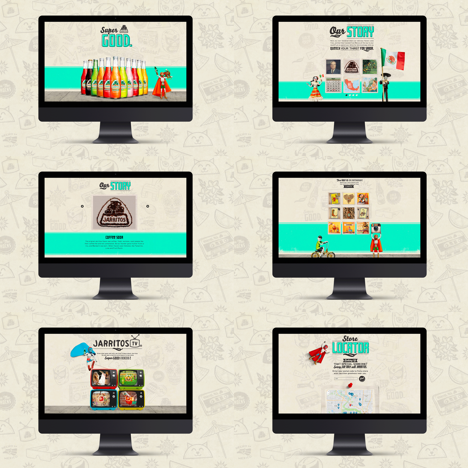
WEBSITE REFRESH
I also helped lead a moderate refresh for the brand’s website which incorporated additional illustrations, brand elements, and integrated more of the brand’s history into the website.


